|
Click Photos to Enlarge
|
10th Project:
Reflection: 1. I'm still new to working with 3D pieces so planning the spacial layout takes extra thought for me. I also had to figure out how to get the wire to stand up and hold the paper cutouts. Another important aspect was sketching and cutting out the birds, and choosing which silhouettes would convey the motion I wanted the best. 2. I drew inspiration for this piece from my book carving piece. While researching many photos and artists for that piece I came up with the idea for this one. Furthermore, I wanted a piece that would contrast with that one - hence this is monochrome and coming off the page instead of colorful and going into the book. 3. The biggest issue was planning how to get the wire to stand, originally I thought I might hang it from something above, or cut into the book, but then I had the idea to shape the wire into a spiral sort of stand, that way i knew it could balance independently of any glue. I also had to draw and cut out the birds and plan the layout, I knew from the beginning that I wanted the birds to spiral out of the page. I also decided not to have any text in the piece, though I considered writing "once upon a time" to tie in my fairy tale motif, but chose to leave it out to keep the pieces more minimalistic. 4. I would try to glue down the pages better so that they are less wrinkled looking. 5. This piece was inspired by the power of words and stories. While they can foster stereotypes, they also empower their readers by providing the freedom to dream, and escape from reality. The birds lifting off the pages represent this power. I created a monochrome piece to juxtapose my other book piece and to maintain the original contrast between the next in the book and the birds coming off the page. It additionally connects to my other pieces through the common motif of fairy tales and the theme of dreams. |


|
9th Project:
Reflection: 1. This was my second alcohol ink project. I've gotten better at knowing how to mix and layer the colors to get the effect I want. I also experimented with smearing the ink and splattering the rubbing alcohol on top of a piece. 2. I drew inspiration from the art exhibits I saw last year, a few of which had small pieces interspersed like these pieces throughout their exhibit. 3. As this piece is a series I tried to make sure the combination of pieces was balanced - some dark pieces, some lighter, some with red, etc. I also tried to balance the techniques I used so the pieces didn't all look the same. 4. I would hope to have more colors or possibly try diluting some of the ink so I can have more variation in the pieces. 5. This series is very similar to the larger piece I did on glass. Likewise, the abstract blue can represent water - which typically signifies fresh starts and change, it can also represent clouds which are light and airy and typically associated with dreams. The distinct layers show how dreams/aspirations can be multi-faceted and combined with the movement in the piece shows how they are fluid. It also gives the audience a chance to reflect on their own dreams by literally seeing their reflection in the mirror pieces. They are each unique unto themselves, like each person and their dreams. |
Click Photos to Enlarge
|


|
Click Photos to Enlarge
|
8th Project:
Reflection: 1. I created the collage by combining numerous different textures/patterns/objects to convey my theme. 2. I drew inspiration from Edyth, who I watched make multiple amazing collages throughout the year. She always combined increasingly random techniques to make pieces that somehow ended up harmonizing and working together. 3. Throughout the process of making this piece I had an idea in my head of what I wanted to convey. From that idea I found different materials, first papers, that I could work into my vision. Next I cut the papers into random shapes and glued them in a gradient from stereotypically feminine to masculine and made sure it was balanced and flowed clearly. I then figured out how I wanted to add the 3D aspects of the collage while maintaining the balance. 4. I'm very happy with how the piece turned out, but next time I would add more text/phrases in the collage. 5. This piece connects to my theme of dreams and aspirations by demonstrating how society dictates what people should be, it comments on out ability to break from those standards. |


|
7th Project:
Reflection: 1. Carving the book was really difficult, it took a lot of forethought to figure out how to create the piece by removing negative space. I also had to test what paint would be best to get the effect that I wanted and found that the Tempera was translucent enough without wrinkling the paper. 2. I drew inspiration from many artists and researched lots of techniques and styles of book carving. I also got advice from my peers who had done similar projects, 3. I began by planning the composition I wanted to carve, I then cut each layer from the foreground to the background. On the right is a smooth, easy path, through a forest and on the left is a harder path to follow, obstructed by bushes and eventually curving through hills toward the mountains. Carving was the hardest and most time consuming aspect and the composition developed slightly to fit best on the pages. Then I determined which paint would be best for adding color and planned how I wanted to color the piece. I used a gradient in the sky moving from light - which would be the easier path, to dark - above the harder path and the mountains. I painted details on the mountains and trees in the background, and through shading and color created depth and the appearance of light filtering through the forest. Lastly I added details in black pen on the top and darkest layer of the forest and wrote a quote from Robert Frost's poem. 4. I would carve less depth but with more detail on each layer. I would also try making monochrome pieces or not adding any detail. 5. This piece represents the choices we must make in life, often the easiest path isn’t the right one, which can be seen through the dark lighting painted and obstacles carved on the right path versus the bright light and relative smoothness of the path on the left. It connects to my theme of breaking apart from society and forging your own path. |
Click Photos to Enlarge
|


|
Click Photos to Enlarge
|
6th Project: No Experience Needed
Reflection: 1. This project was my first time using alcohol ink. I experimented with different surfaces and ways of combining the ink I researched many different methods and decided to try burning the alcohol ink for an abstract stained glass effect. I'm very happy with the end effect. 2. I drew inspiration from many different artists and tutorials online. By watching others use alcohol ink I was able to approach the project knowing how I could use the medium. 3. I experimented with different surfaces and methods, I swirled ink around on the glass and diluted areas with rubbing alcohol and layered more ink. For my composition I originally only wanted ink in the bottom corner but later decided covering all the edges and leaving space in the middle gave the best effect. By layering the ink I created interesting texture and value which made bubble like shapes which gave harmony to the image. The varying shades of blue created repetition and unity. 4. I want to make a larger piece and potentially use mirror instead of glass. 5.The common thread between my pieces is the color scheme and theme of dreams/aspirations. The abstract blue can represent water - which typically signifies fresh starts and change, it can also represent clouds which are light and airy and typically associated with dreams. The distinct layers show how dreams/aspirations can be multi-faceted and combined with the movement in the piece shows how they are fluid. |


|
Fifth Project:
Reflection: * After completing this project I later returned and made the changes I had previously considered - both the old version (photo 2) and the updated (photo 1) are included here. 1. For this project I used Photoshop. Techniques I used included layer masking, layer opacity, layer effects, layer and entire canvas adjustments, and used the paint brush some. I became much better at masking images to make different layers look natural, and at adding adjustments to individual layers. 2. The main artist I drew inspiration from was Brooke Shaden - she does a lot of Photoshop work making fantastical pieces from photos she has taken. She combines layers and radically changes color and value in parts of her pieces. By watching videos of her process I was able to improve my skills. 3. I originally based my piece off different photos but they were not high enough resolution so I had find new photos and start over. Originally I was going to have water across the entire bottom third but then the subject was too small. The composition changed as I found photos I liked, but the concept was always the same. 4. I would change the color of the dress to add more contrast in the photo. 5. This piece continues my theme of dreams/aspirations by depicting a storybook princess running away from the dark castle - which symbolizes society's oppressive expectations. The princess is the same female figure I've been using across many of my pieces. |
|
|
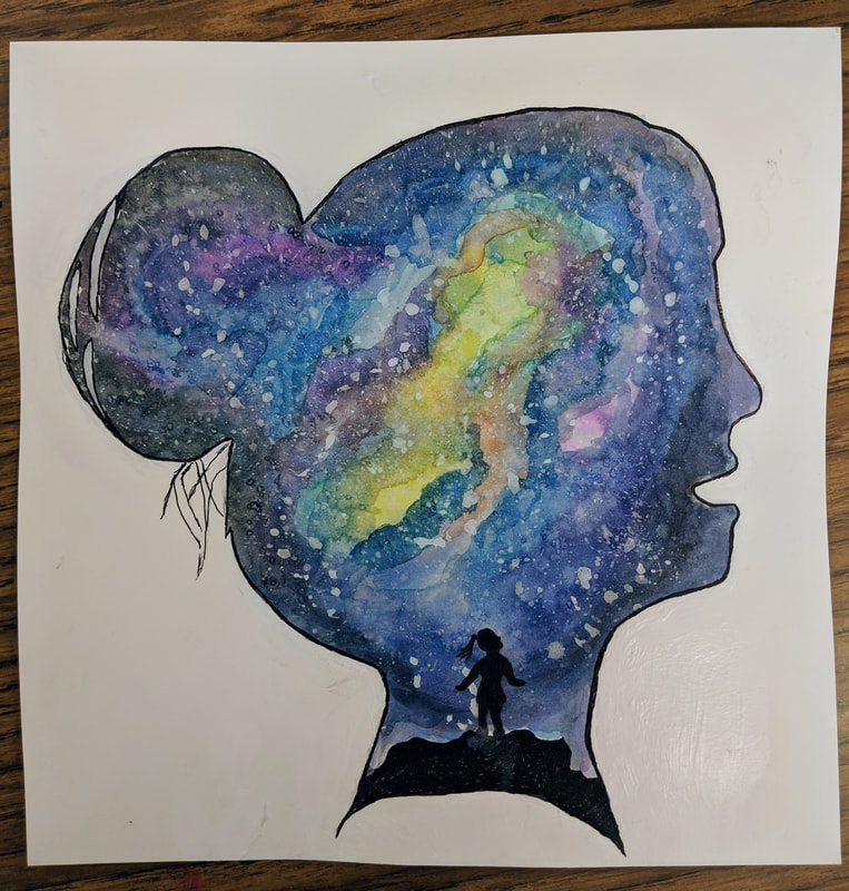
Fourth Project:
Reflection: 1. I used watercolor for the first time in a while. I layered and blended colors and used salt to add texture. I learned how to splatter acrylic which I used for the stars. 2. I drew inspiration from Mike Herrod who uses watercolor and ink for his colorful illustrations. His art is bright, whimsical, and youthful; and while his subjects were very different from my ideas, the techniques and themes he employs inspired me. 3. After choosing which colors to use I practiced mixing them and getting the right values. I outlined the face with pencil and taped it. Then I did multiple layers of watercolor adding colors and making the edges darker. As each layer began drying I added table salt, which didn't work very well, so I used kosher salt. The salt added texture and began a stary effect. I then learned how to splatter paint and experimented to get the right combination of white acrylic and water and used it to add stars. After it dried I cleaned up the edges with white paint and outlined it in black pen. My final step was to draw the silhouette at the bottom. I used extra white paint to clean up the edges add make sure there was stark contrast between the galaxy and the background, the black ink also helped with this. 4. I would potentially make the yellow in the sky less bright or experiment with different colors for the galaxy. I also might cut the galaxy out from the original paper to make the lines cleaner. 5. This piece aligns with my common theme of dreams and aspirations. It also continues the pattern of self reflection. The girl who is silhouetted is exploring the vastness of the universe, in both the internal possibilities for herself and in the external world. Additionally the galaxy implies night and hence literal dreams. |
|
Second Project: Social Issue Piece
Reflection: 1. I did well removing the backgrounds from the silhouettes, editing the background, and adding layers and gradients in Photoshop. I struggled to add shadows and with finding high enough quality photos. 2. One artist I've been interested in is Brooke Shaden. She uses complex techniques in Photoshop and watching videos of her process has helped me improve my own. I also got inspiration from the MCA art show theme. These helped me connect the piece to society and the way people are so attached to and reliant on technology. 3. First I changed the background a few times, and then I edited the one I ended up choosing. I appreciated the depth and direction created by the lines in the city block and the lighting worked well with silhouettes. I had a fairly concrete concept going into it, but I changed details like which figures I used and which pictures of people I wanted 'projected' from the screens. I spaced each person out so that the viewers eyes would move from the person who is still loading back to the others who know what they want. 4. Next time I would try to ensure the photos are higher quality and I would add shadows for the silhouettes. This would allow the piece to be printed at higher quality and would ground the subjects in the photo. 5. This links to the other piece I have done as both explore identity and how we perceive ourselves. |

|

|
First Project: Self Portrait
Reflection: 1. I got much better at shading and adding layers slowly to achieve the effect I want. I struggled to get texture like my hair which had both very dark shadows and white highlights, but wasn't grey. 2.I looked to artists such as Stanley Lau and Casey Baugh who both create amazingly realistic charcoal portraits. While they have somewhat different techniques both are experts at shading and getting texture in their pieces. 3. I began by analyzing the structure and composition of my face in the photo I took. I then transferred those measurements on to a larger sheet of paper and attempted to space out each element of my face. After multiple adjustments I slowly added shading and details. 4. I would begin with the highlights in my hair and keep them very distinct strokes and alternate adding in shadows with black charcoal. I would also add more detail and shading in my shoulders and chest. 5. This was a continuation of my work with charcoal. I have also done some other projects in pastel which is similar, and used other black and white media. |
|
|


|
|
|
